Nature Color Palettes: 5 Most Popular Colors For a Beautiful Home
Discover How Nature’s Hues Can Elevate Your Home Décor.
Choosing colors inspired by nature color palettes can transform your home into a peaceful and inviting space. Each shade reflects the beauty of the outdoors, bringing in a sense of calm, warmth, or vibrancy. From soothing blues to rich browns, these nature color palettes are perfect for creating a balanced and harmonious environment. Here’s a look at the most popular color options and how they can be used to elevate your home.
Table of Contents
1. Blues
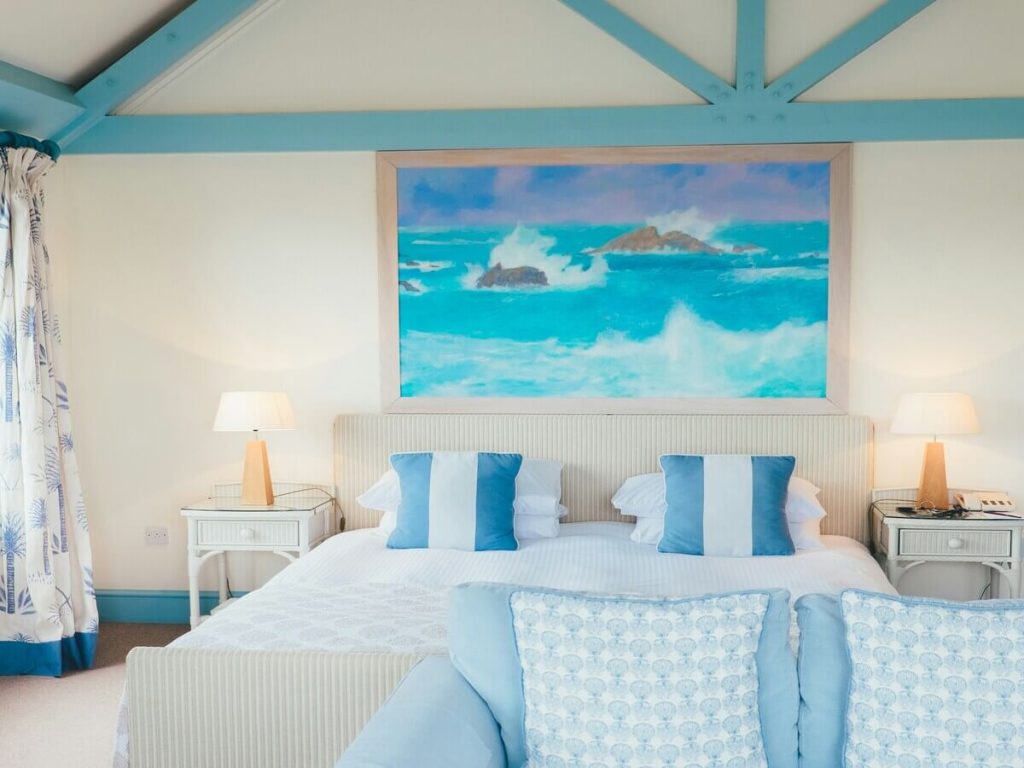
Blues are versatile colors often associated with the sky and sea, creating a calming and serene atmosphere ideal for spaces where relaxation is key. Light blues, reminiscent of clear skies, pair beautifully with whites, soft grays, and sandy beiges, giving rooms a fresh, coastal feel. They reflect natural light well, making smaller rooms appear brighter and more spacious.
Interesting Fact:
According to color psychology research, blue is often linked to feelings of calm and tranquility, which is why it’s frequently used in spaces designed for relaxation.
This shade is perfect for bedrooms and bathrooms, where a light, airy environment is desired. Light blue is currently popular in minimalist and coastal designs, adding a crisp, clean look that feels open and refreshing.
Did You Know?
Light blue is known to lower heart rates and reduce anxiety, making it an excellent choice for stress-free zones in the home.
Deeper shades like navy blue and dark blues add sophistication and depth, evoking the rich tones of the ocean at dusk. Navy blue, in particular, is a classic choice for upscale settings, often seen in modern home offices and dining rooms where its bold yet elegant nature shines.
Color Tip:
Use navy blue as a backdrop for artwork to make colors pop and add visual interest.
These colors pair wonderfully with warm metallics like gold or brass, which add a touch of luxury. To complete the look, navy blue works best under soft, warm lighting that enhances its deep, dramatic feel without overwhelming the space.
Design Idea:
Create a focal point with a navy blue accent wall paired with metallic frames and lush green plants.
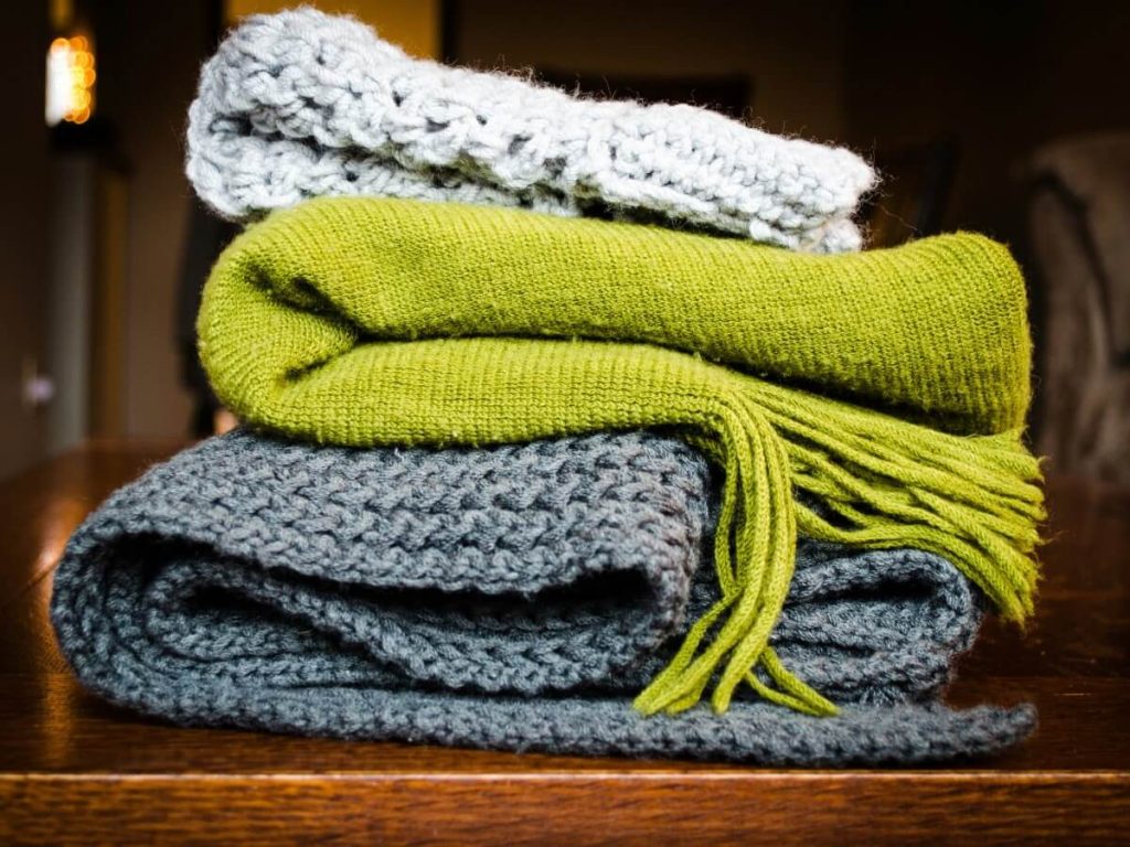
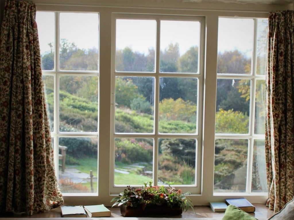
2. Greens
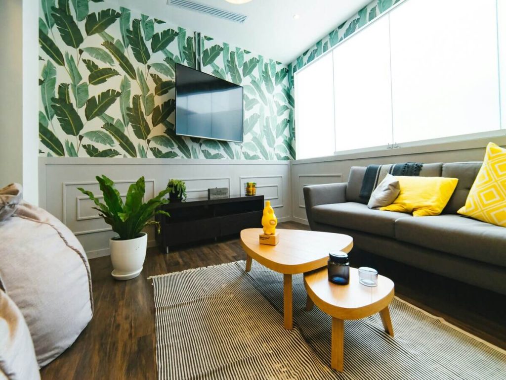
Greens bring the freshness of nature indoors, symbolizing growth, renewal, and tranquility. This versatile color works beautifully in almost any room, from kitchens to living rooms, thanks to its calming and restorative qualities. Bright greens, inspired by vibrant gardens, inject energy and life into spaces.
Did You Know?
Studies have shown that green hues can improve concentration and reduce eye strain, making them perfect for workspaces and study areas.
Imagine a bright green kitchen that feels alive and fresh, paired with light woods and white accents to create a cheerful, invigorating environment. In contrast, muted greens like sage and olive offer a softer, more subtle nod to nature, making them ideal for living areas and bedrooms where a serene atmosphere is desired.
These softer greens are particularly trending in modern design, often used in cabinetry and walls to create a timeless, sophisticated look. They work best with warm or natural lighting, which enhances their organic, earthy tones. Forest green, with its rich, deep hue, captures the essence of dense woodlands and adds a dramatic, luxurious feel to any room.
Color Tip:
Use forest green in rooms where you want to feel a sense of calm and retreat, like a bedroom or reading nook.
For those looking to personalize their space, greens can be customized from bright, fresh shades to deeper, moody tones, offering endless possibilities. Complete the look with green plants, woven baskets, and natural fiber rugs that complement the color and enhance the natural theme.
3. Neutrals
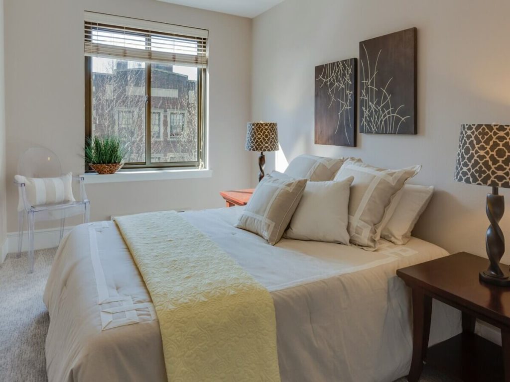
Neutrals like cream, beige, and gray are foundational colors that provide versatility and timelessness to any interior design. These colors act as the perfect backdrop for more vibrant hues, adding warmth, light, and sophistication without overpowering the room. Cream, with its warm undertones, softens spaces and reflects light beautifully, making rooms feel bright and welcoming.
Interesting Fact:
Beige and cream are considered “safe” colors that appeal to a broad audience, making them popular choices for staging homes for sale.
Beige offers an earthy, grounded feel, perfect for creating a comfortable and inviting environment in any space. In recent trends, warm beige tones have been favored for their ability to create serene, minimalist looks that feel both modern and timeless.
Gray, on the other hand, brings a cool sophistication, blending seamlessly with both warm and cool tones, making it ideal for contemporary designs. Gray cabinetry in kitchens, for example, adds a sleek, modern touch that balances well with stainless steel appliances and wood accents. Neutrals work best under soft, warm lighting, enhancing their cozy appeal.
Design Idea:
Add texture to neutral rooms with layered textiles like chunky blankets, woven rugs, and soft drapery.
When looking to customize these shades, consider adjusting the undertones to match the specific needs of your space, whether that’s a warmer or cooler look. Enhance neutral spaces with textured throws, wooden frames, and ceramic vases to add dimension and interest.
Color Tip:
Neutrals are perfect for balancing bolder colors in a room. Use gray as a neutral anchor for bright accents like yellow or teal.
4. Browns
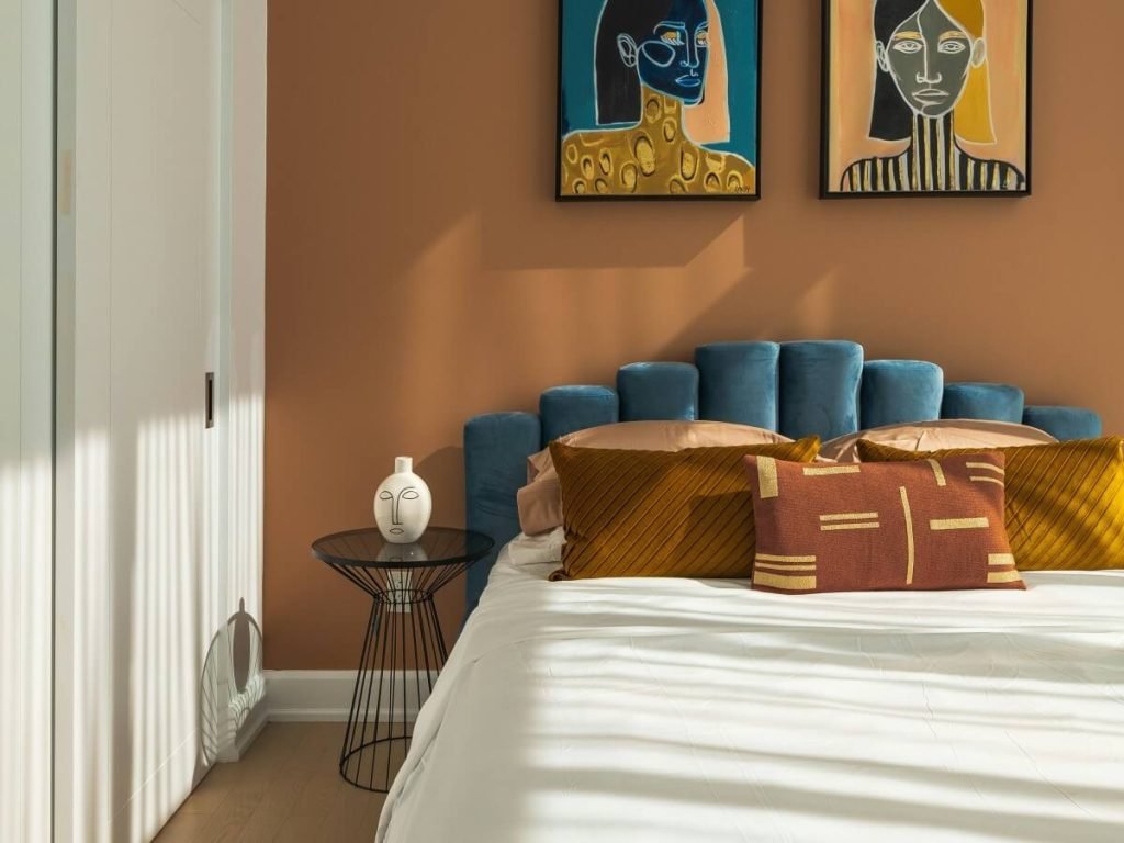
Browns are earthy, warm colors that add a sense of natural comfort and stability to your home. From soft tans to rich walnut tones, browns evoke the warmth of nature, connecting your home to the outdoors. Lighter browns, like earth and rust tones, reflect warmth and make spaces feel inviting, perfect for living rooms and bedrooms where a cozy atmosphere is desired.
Fun Fact:
Brown is often associated with security, reliability, and grounding, making it a great choice for family rooms and spaces where comfort is key.
Rust brown, reminiscent of autumn leaves, adds a rustic charm that’s perfect for accent walls or textiles, bringing a lived-in, comforting feel to any room. Currently, earthy browns and rich, deep tones are trending as part of the broader shift towards natural, organic interiors.
Darker browns, like walnut, absorb light and add richness, often used in furniture and cabinetry to create a timeless, elegant look. Browns shine best under warm, soft lighting, which highlights their natural warmth and complements their organic feel.
Color Tip:
Use walnut brown for cabinetry and furniture to create a classic, sophisticated look that stands the test of time.
To personalize, browns can be customized from light taupe to deep espresso, allowing you to find the right tone that matches your desired aesthetic. Complete the look with leather accents, woven baskets, and wood décor to amplify the earthy vibe.
Design Idea:
Pair brown tones with terracotta accents and earthy ceramics for a warm, Mediterranean-inspired feel.
5. Soft Pastels
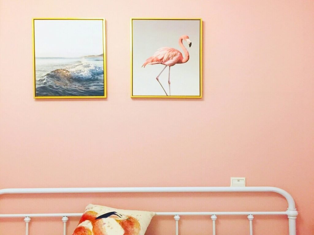
Soft pastels like pink, purple, and peach bring a gentle, soothing touch to interiors, adding a light, cheerful vibe without overwhelming the senses. These colors are perfect for creating a soft, airy feel, especially in spaces designed for relaxation like bedrooms and nurseries.
Did You Know?
Pastels are known to evoke feelings of peace and contentment, making them ideal for spaces where you want to relax and unwind.
Pastels pair wonderfully with neutrals such as cream and gray, as well as light greens and blues, creating a fresh, delicate look that feels both modern and classic. In current design trends, pastels are being used to add a subtle, playful touch, often seen in accent walls and decor pieces.
Pastels reflect light softly, enhancing brightness without being overpowering, making them ideal for smaller rooms that need a touch of color without losing their openness. They work best with soft, warm lighting, which highlights their gentle hues and maintains a soothing atmosphere.
Color Tip:
Use pastel shades in unexpected places, like window trims or inside bookshelves, for a pop of color.
For a personalized approach, custom shades of pastel can be adjusted to create the perfect balance of warmth and light. Accents like light wood furniture, soft textiles, and decorative ceramics enhance these colors, creating a cohesive and inviting space.
Design Idea:
Soft pink walls in a bedroom paired with white bedding and light wood accents create a serene and welcoming environment.
Conclusion
Choosing a nature-inspired color palette is a great way to bring the beauty of the outdoors into your home. Whether you prefer the calming blues, the vibrant greens, or the warm earthy tones, each palette offers a unique touch that can transform your space into a serene sanctuary. Experiment with these popular nature color palettes to create a home style that reflects your preferences and connects you with nature.
FAQ
Q1: Can I mix multiple nature-inspired colors in one room?
Yes, mixing different nature-inspired colors can add depth and interest. Just make sure the shades complement each other for a cohesive look.
Q2: How can I add nature-inspired colors without repainting?
Incorporate nature-inspired colors through accessories like cushions, rugs, artwork, or even plants to bring in those natural hues without major changes.
Q3: Are metallics suitable for nature-inspired homes?
Yes, metallics like silver can add a modern touch that contrasts beautifully with softer, natural colors, enhancing the overall design.
Q4: What colors pair well with earthy tones?
Earthy tones like taupe and terracotta pair well with greens, neutrals, and wood tones, creating a warm and balanced look.
Q5: How do I choose the right nature-inspired palette?
Think about the mood you want to create—calm, vibrant, or cozy—and select colors that reflect those feelings. Consider the natural elements you love, like forests, oceans, or sunsets, to guide your choices.